In this video Chicago, based photographer John Gress shares his ideas based on his experience about using several colors in an image in a way that will create better harmony in the shot.
The concept of color harmony does not necessarily come up that much in photography on its own but the way colors, backgrounds, gels, and other such aspects affect the final image do come up a lot and combining them into a cohesive look is what color harmony is all about.
Using the color wheel calculator
one way of creating color harmony in your shot is just trying different things and see what looks best and this is of course a valid way but it can take a lot of time. A different way Gress suggests is using a tool like the one found on the Arizona-based online college called Sessions College (see a link here). We actually prefer a different tool on the Canva website which you can find here and is simpler to use in our view.
The tool has five types of harmonies (please note that there is also a 6’th mode called split complementary which is not represented below)::
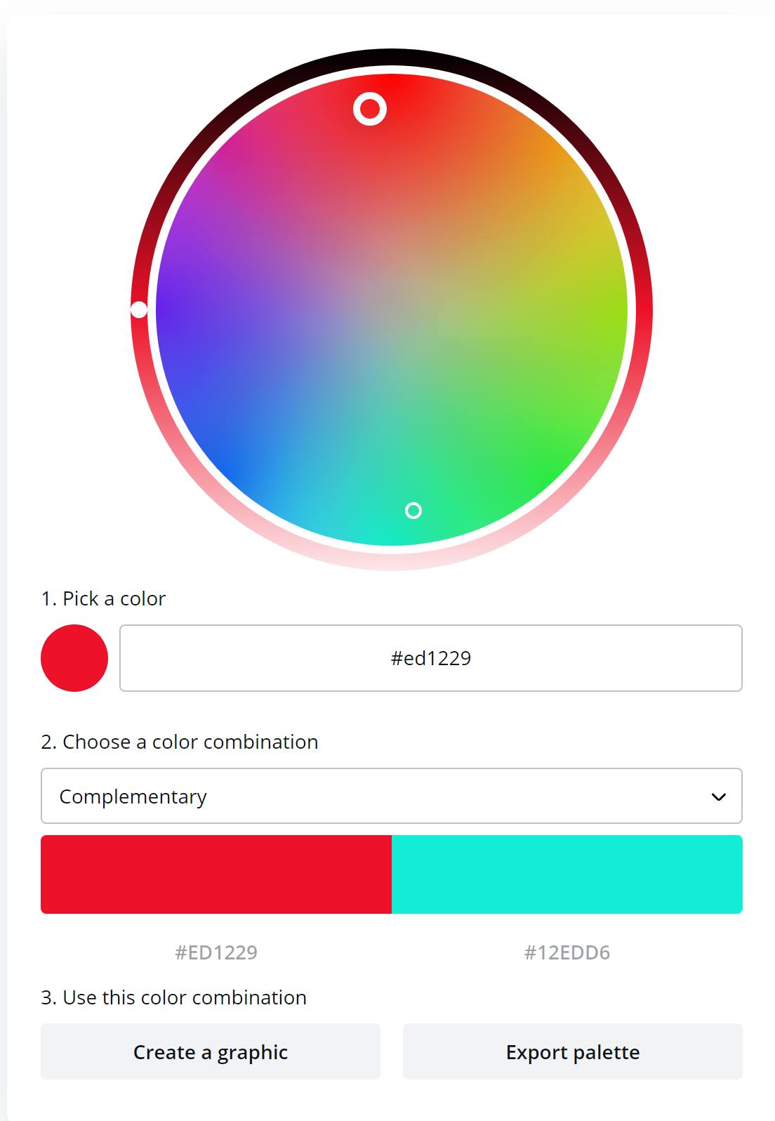
Complementary
This mode will show you one color and the opposite one on the other side of the color wheel. This combination is said to provide more contrast and a high-impact color combination.
An example of complementary colors from the Canva tool
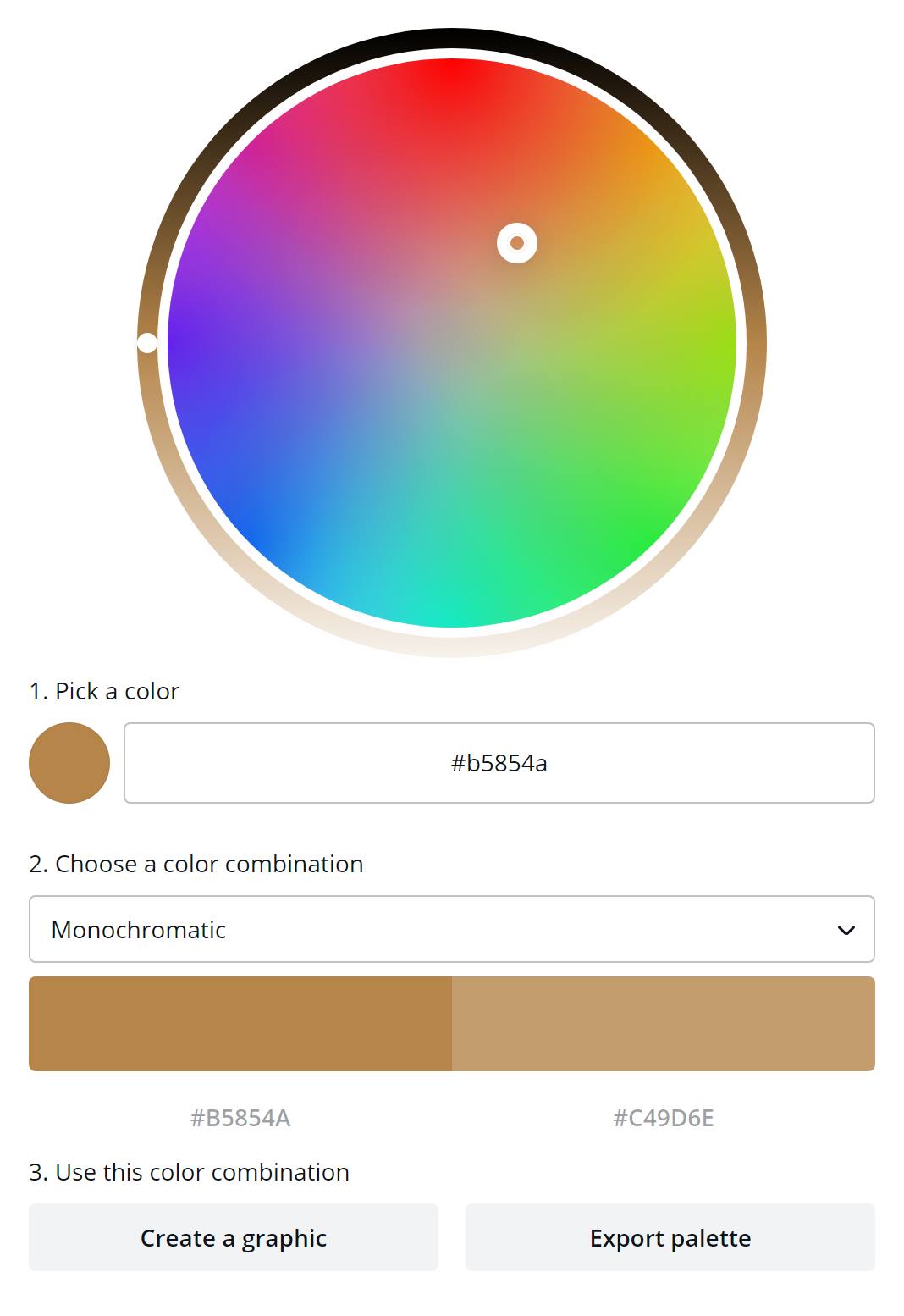
Monochromatic
This mode will provide you with a second color which is close and is shade, tone, and tint of one base color.
An example of monochromatic colors from the Canva tool
Analogous
This mode will give you three colors that are side by side on the color wheel. This combination can be very powerful (maybe too powerful at times) so in order to balance it, it is suggested that you choose one dominant color, and use the others as accents.
An example of analogous colors from the Canva tool

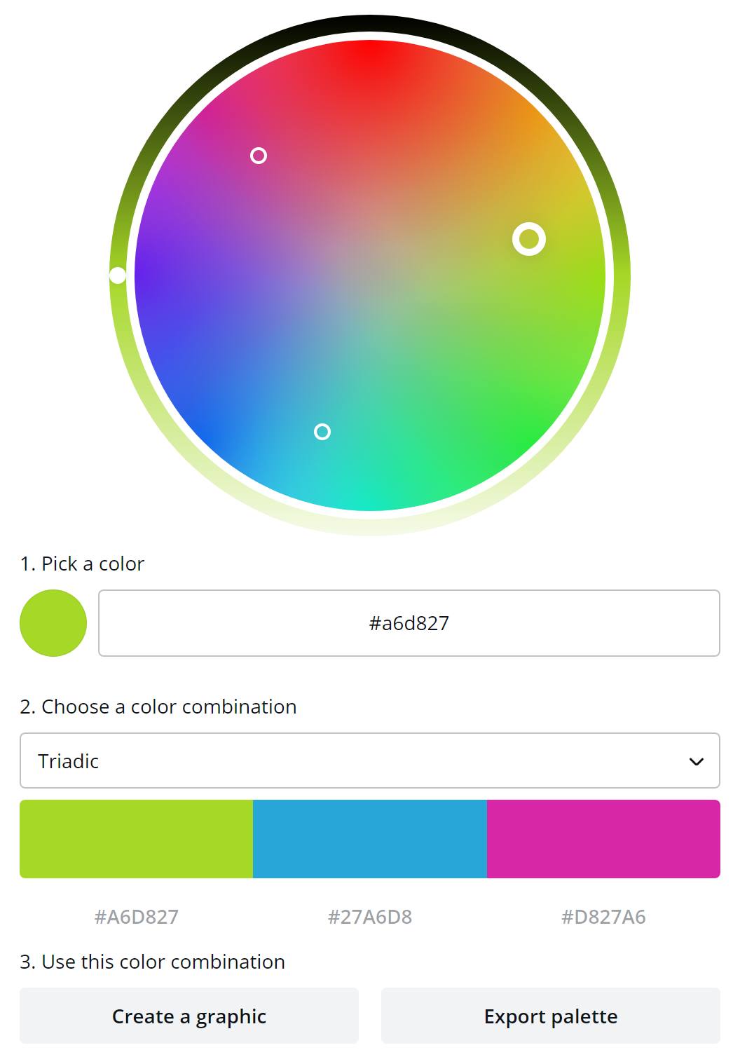
Triadic
This mode will again give you three colors that are evenly spaced on the color wheel. It is said to provide a high contrast color scheme that is bold and very vibrant.
An example of triadic colors from the Canva tool
Tetradic
In this mode, you have 4 different colors that are evenly spaced on the color wheel. Like triadic color schemes, these are also very bold and they are said to work best if you let one color be dominant, and use the others as accents just keep in mind that the more colors you have in your palette, the more difficult it is to balance between them.
An example of tetradic colors from the Canva tool

Real-world Examples
In the video, Gress chose examples for each of the different color modes/schemes which is actually much more useful for photography for understanding how to use those combinations of colors.
What you need to realize that color can come in different ways and places in an image. Color can be in the background the clothing, the accessories, or the lighting. So you will have a lot of room to play around and choose the color schemes that are right for your shot.
Gress also emphasizes something important – this whole color wheel theory is something that can help you but these are not rules set in stones – if you find a similar set of colors that look better to you – go with them – the color harmony tools are just another way to help you get to the result that is right for you.
Bonus video: f64 Academy with 3 secrets to color grading your images

As always you can find more helpful photography tips on our Photography tips section and you can find more of John Gress on our dedicated page here on LensVid.
You can support LensVid by shopping with our affiliate partners
Affiliates: Amazon, B&H, Adorama and E-bay.
Why should you trust us?